Pink Poogle Toy Forum

The official community of Pink Poogle Toy. Bear with me while I tweak everything
It is currently Wed Sep 16, 2026 4:24 am

All times are UTC


Post new topic  This topic is locked, you cannot edit posts or make further replies.  [ 137 posts ]  Go to page Previous 15 6 7 8 9 10 Next
Author Message
 Post subject:
PostPosted: Wed Jun 22, 2005 1:06 am 
PPT Trainee
PPT Trainee
Offline

Posts: 527
Joined: Thu Jul 15, 2004 5:53 pm
Website: http://magikwishez.deviantart.com/
Location: Los Angeles, California
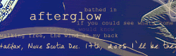
paola :: I like the colors you used so far. For the font, you can try using a grungy-ish font or a font that's easy to read. Super curly fonts are a no-no. x] Are you going to add a border? The color burn edges is a neat idea. *looks at the original picture* Wow, you made things look a lot clearer. The white thing located in the top left corner bother me for some reason. x_x It looks like a blank spot in the siggie. But it can't be helped, since it's part of the original picture. :P

fzun :: The glow's color on the siggie seems kinda off. But I really like the colors you used for this set. They seem so relaxing... :] I like the shining effect also. And as mentioned by Amethyst, the text on the avatar isn't very noticable. I think you should broaden the border for the av's text and lower the opacity of the text on the siggie. Oh and I really like the gradient border on your set. ^_^

Can someone please rate my current set? I haven't changed my set since Valentine's Day so that means I haven't made any graphics since then. XD Criticize all you want!! :D

_________________
Image
Set made by SECRET SANTA! ♥ Thank you! ^___^


Top
 
   
 Post subject:
PostPosted: Sun Jun 26, 2005 10:40 pm 
PPT Trainee
PPT Trainee
Offline

Posts: 571
Joined: Tue Jun 21, 2005 12:11 pm
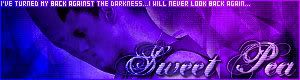
magikwishez ~> I really love your set. The blue colors are nice and soft and light. And then it's not boring or one solid color. I like how there's bits of darker blue shade on your set, too.

I like how the main text/title is "sitting" on your subtext and kind of interwoven there a bit..... n_n;;

So pretty. I love blue stuff, too. 9/10. :)

_________________
Image
set by me | 12.17.o5


Top
 
   
 Post subject:
PostPosted: Mon Jun 27, 2005 4:56 pm 
PPT Student
PPT Student
Offline

Posts: 402
Joined: Mon May 31, 2004 8:39 pm
ICQ: 177501617
Website: http://www.infectedheart.ledzic.com
Location: Soup
Paola Wow. Nothing to complain about this one. Except it seams... cramped. But that's just the size of the image. I wouldn't add anything else to the sig. It looks great the way it is. Colours, texture, great blending. ;) 9.7/10

magikwishez Wow. I really like the texture that you've created in the background. Kinda plain and simple. But I like it. 9.2/10

-----
My turn to get yelled at. It's only second go on PS7. So I know it stinks.
Image

_________________
Image
quick set by me//


Top
 
   
 Post subject:
PostPosted: Mon Jun 27, 2005 5:43 pm 
Beyond Godly
Beyond Godly
Offline

Posts: 4673
Joined: Mon May 31, 2004 5:14 pm
Website: http://community.livejournal.com/racomic/
Location: Inside a box
Noelle: I like it! My only complaint is that the image looks a little overexposed....Maybe you could tone that down a bit? Also, the text is a little hard to read against the background. It's very good for only your second try, though^^

Ratings for my sig?

_________________
Image


Top
 
   
 Post subject:
PostPosted: Tue Jun 28, 2005 3:00 pm 
PPT God
PPT God
Offline

Posts: 2364
Joined: Mon May 31, 2004 4:19 pm
Website: http://www.speculationcentral.com
Yahoo Messenger: DFire870
Location: Austin, Texas
magikwishez: I love the blue color scheme a lot. I also like how the main text is sitting on the subtext. Also a great choice of brushes. My only complaint is the subtext is a little hard to read for me, but that's probably me.

Noelle: Wow, pink. :P That's awesome for your second try, but the main text is a little hard to read since it's all pink.

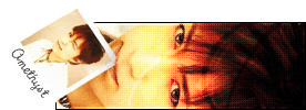
Amethyst: Nice and simple; I like it. Although, the space where the northern lights are seems to be a little empty, but I guess that's supposed to be like that.


Ratings for this set? This was my first set in Photoshop CS. I used a tutorial too. xD

Image Image

_________________
Image

Speculation Central - Thinking about the future... Today!


Last edited by Dragonfire on Wed Jun 29, 2005 10:17 pm, edited 1 time in total.

Top
 
   
 Post subject:
PostPosted: Tue Jun 28, 2005 3:52 pm 
PPT Trainee
PPT Trainee
Offline

Posts: 571
Joined: Tue Jun 21, 2005 12:11 pm
Dragonfire ~> I like the color scheme and the modern/sci fi or something feel of it. n_n

I don't like how the 'Digital Guardian' text is right under the border if you know what I mean. Because the left side has a space between the border and the text and the top of the text doesn't. Just not even-looking to me. :3

However, I like the Dragonfire text. Modern looking font and it fits nicely.

I like the brightness in the middle of the banner, but I would like it more if it was balanced on the sides with the same kind of brightness in some way. Not brightness all over though.

I like the blending effect...flowing it seems.

7/10.

_________________
Image
set by me | 12.17.o5


Top
 
   
 Post subject:
PostPosted: Tue Jun 28, 2005 7:43 pm 
PPT God
PPT God
Offline

Posts: 2364
Joined: Mon May 31, 2004 4:19 pm
Website: http://www.speculationcentral.com
Yahoo Messenger: DFire870
Location: Austin, Texas
Sweet Pea wrote:
Dragonfire ~> I like the color scheme and the modern/sci fi or something feel of it. n_n

I don't like how the 'Digital Guardian' text is right under the border if you know what I mean. Because the left side has a space between the border and the text and the top of the text doesn't. Just not even-looking to me. :3

However, I like the Dragonfire text. Modern looking font and it fits nicely.

I like the brightness in the middle of the banner, but I would like it more if it was balanced on the sides with the same kind of brightness in some way. Not brightness all over though.

I like the blending effect...flowing it seems.

7/10.


I didn't notice that the subtext was uneven until I posted it on here, as in PS it looked even. It also only took me like 15 minutes for the sig since I was just testing PS out. I'm probably going to remake it though and use more colors from the middle image. :P

EDIT: I redid, and made alot of changes, and I reuploaded it. I think it looks alot better now :P

_________________
Image

Speculation Central - Thinking about the future... Today!


Top
 
   
 Post subject:
PostPosted: Fri Jul 01, 2005 2:12 am 
PPT Trainee
PPT Trainee
Offline

Posts: 749
Joined: Wed Aug 11, 2004 12:25 pm
edit: post removed..........


Top
 
   
 Post subject:
PostPosted: Sat Jul 02, 2005 7:27 pm 
PPT Trainee
PPT Trainee
Offline

Posts: 571
Joined: Tue Jun 21, 2005 12:11 pm
Dragonfire wrote:
I didn't notice that the subtext was uneven until I posted it on here, as in PS it looked even. It also only took me like 15 minutes for the sig since I was just testing PS out. I'm probably going to remake it though and use more colors from the middle image. :P

EDIT: I redid, and made alot of changes, and I reuploaded it. I think it looks alot better now :P

Great! It looks much better now. n_n

I like how the small text is under the title.

I noticed the improvement in your set while I was browsing the forum, too. ^^

_________________
Image
set by me | 12.17.o5


Top
 
   
 Post subject:
PostPosted: Sat Jul 02, 2005 7:52 pm 
Way Beyond Godly
Way Beyond Godly
Offline

Posts: 8715
Joined: Sat Jun 05, 2004 9:10 pm
Website: http://abelha-rainha.deviantart.com
Location: Cleveland, Georgia
Dragonfire - Pretty image. :) The way the subtext is under the main text is awesome, the only thing I could think of is...uh...nothing. XD

Anyone care to rate my current set? I'm planning on redoing it, so any screamings, I mean ratings (*pokes Noelle*), are welcomed. (I will be changing to subtext to Hanging by a Moment by Lifehouse.)

Image Image

_________________
Image


Top
 
   
 Post subject:
PostPosted: Wed Jul 06, 2005 4:01 pm 
PPT Student
PPT Student
Offline

Posts: 305
Joined: Thu Jun 03, 2004 9:27 pm
Location: tortuga
Dm: It's a little plain, the coloring on Chii seems a little, bad. the colorizing made the image look bad quality, and the background is plain. All your sets look the same, and the positioning is always the same, try to randomize it a bit :) :D 7/10

could someone rate this set I made?:

Image
Image

Thanks! ^^ :)

_________________
Image
signature by WIS! :]


Top
 
   
 Post subject:
PostPosted: Thu Jul 07, 2005 6:34 am 
PPT Student
PPT Student
Offline

Posts: 304
Joined: Fri Jun 24, 2005 4:19 am
Location: Denmark
I think they are very good, I like the use of dark colors and the font looks very good on them. I cant really seem to think of anything else.


Top
 
   
 Post subject:
PostPosted: Fri Jul 08, 2005 6:53 pm 
Beyond Godly
Beyond Godly
Offline

Posts: 4673
Joined: Mon May 31, 2004 5:14 pm
Website: http://community.livejournal.com/racomic/
Location: Inside a box
Moofy: Very original. I like the way the colors stand out from the white. Maybe you could move the text up a little more, though....Where it is now, it's a little hard to read.

Ratings for my new set anyone?

_________________
Image


Top
 
   
 Post subject:
PostPosted: Sat Jul 09, 2005 1:19 pm 
Beyond Godly
Beyond Godly
Offline

Posts: 3780
Joined: Mon May 31, 2004 4:56 pm
Website: http://www.livejournal.com/users/cookiehammy
Location: Right here, I think.
Ammy: Very awesome! I like the way "Amethyst" on the avatar and "Heaven is Lost" on the signature look exactly the same amount of pixels away from the edge - it makes it look symmetrical. The lack of main text on the signature adds to the effect. 9/10.

Would some please rate this set?

Image Image

_________________
Image
|| Set // WIS < 33 ||


Top
 
   
 Post subject:
PostPosted: Sat Jul 09, 2005 7:39 pm 
PPT Trainee
PPT Trainee
Offline

Posts: 571
Joined: Tue Jun 21, 2005 12:11 pm
Amethyst ~> I like the technique you used in your set...the motion/blur-NESS. n_n;; I like how the simple, small bright points of your set is the main features.

You don't have a big title so that helps highlight the background.

7/10 ... Personally, I would have like things more...I dunno...more textured and stuff...more UMPH. :3 But your set is a nice change to see. ^^

.
.
.

Anubis ~> Aww, the bird's kute. n_n I like the colors. But I would have like something done more with the title and text. The title seems cramped in the banner and the subtext does too, a bit. A little plain for my taste, but kute still. ^^

6/10

_________________
Image
set by me | 12.17.o5


Top
 
   
Display posts from previous:  Sort by  
Post new topic  This topic is locked, you cannot edit posts or make further replies.  [ 137 posts ]  Go to page Previous 15 6 7 8 9 10 Next

All times are UTC


You cannot post new topics in this forum
You cannot reply to topics in this forum
You cannot edit your posts in this forum
You cannot delete your posts in this forum

Search for:
Jump to:  
Powered by phpBB® Forum Software © phpBB Limited