Pink Poogle Toy Forum

The official community of Pink Poogle Toy. Bear with me while I tweak everything
It is currently Fri Sep 18, 2026 12:45 pm

All times are UTC


Post new topic  This topic is locked, you cannot edit posts or make further replies.  [ 137 posts ]  Go to page Previous 15 6 7 8 9 10 Next
Author Message
 Post subject:
PostPosted: Fri Oct 01, 2004 12:22 am 
PPT God
PPT God
Offline

Posts: 1851
Joined: Tue Sep 21, 2004 5:58 pm
Website: http://www.theamazingjourney.net
Yahoo Messenger: minaliz82
Location: In Ohio. Catch me if you can :P
robot wrote:
As for my set. It does have my name on it. That is what the Japanese is. As for what I did to the original image, I flipped it, adjusted the contrast, and cut out majority of the background. I was going for that whole.. minimalistic look that I love so much. I'm actually in the process of redoing it. I decided that I don't like it anymore. Well, I do. Just.. not the way it is. :P Expect to see something different in a few days.


AHA! That's what that is. That makes it extra cool, although I honestly wouldn't know that if you hadn't of told me. ^_^;;

_________________
Image

<STOWA|Sleep> my sister questioned the title. "Half Blooded Prince? Does that mean he's a Moogle"


Top
 
   
 Post subject:
PostPosted: Fri Oct 01, 2004 1:59 am 
PPT Warrior
PPT Warrior
Offline

Posts: 900
Joined: Tue Jun 01, 2004 5:03 am
Location: on a chair
Robot: Love it, it's simple yet really nice. The only thing that I see wrong is the subtext, it's blurry and the part where the text goes over the branch is hard to read.

Yoshi: Wow, you are a great artist, I could never draw a hand that good. Anyway, I like the second sig, it doesn't look as plain as the other one, I also like the scratchiness, it gives the set a really cool look, good job!

Can anyone rate?

Image
Image

_________________
-used to be darklegend-
currently: lurking ^-^


Top
 
   
 Post subject:
PostPosted: Fri Oct 01, 2004 3:09 am 
Honorary Member
Honorary Member
Offline

Posts: 1341
Joined: Mon May 31, 2004 9:43 pm
Location: Antarctica
Darklegendary : I love the colors of the image. I don't know if I really like the pixel font, though. It seems a bit out of place. I think I'd like the main text a bit more if it was either "faded" a bit or a softer color in general. It's nice and simple, though. 7/10

-- rate my current set, please. {No, I have no idea what the Japanese says. >.< It's from the original image, but I liked it too much and couldn't bring myself to remove it.}

_________________
Image


Top
 
   
 Post subject:
PostPosted: Sat Oct 02, 2004 6:23 am 
Honorary Member
Honorary Member
Offline

Posts: 3805
Joined: Mon May 31, 2004 4:03 am
Location: Waterloo, Canada
robot: I have absolutely no idea what this set is about, but I like it, haha. Wondering what that "b-thmp" thing is, too. Font fits in perfectly as if it were part of the original image, scanlines (whether they were there in the beginning or not) look good too.

Darklegendary: Oooh, love the picture there, so unique. Just a few things though...first, the things robot mentioned- the fonts don't quite fit in. Also, the picture quality seems a bit subdued (especially in the av and in the right side of the sig), perhaps you could use a few filters or add something in to fix or detract from it. That's up to you, though. XP

(more ratings on current set would be appreciated)

_________________
Image Image


Top
 
   
 Post subject:
PostPosted: Sun Oct 03, 2004 9:05 pm 
Honorary Member
Honorary Member
Offline

Posts: 6220
Joined: Tue Jun 01, 2004 3:02 am
Location: sakura makes dreams come true.
Yoshi- Nice! The hand/arm must of been really hard to draw, and you did it quite well. The theme is very original. On the avatar, how the word 'Yoshi' is written in a chalk-like fashion is pretty cool. However, I dislike the large amount of empty space on the signature. I know you worked hard on it, but it looks a little plain. 8/10

Ratings on my Christmas signature? I feel bored, so I'll give you a form to read.

Time spent on it: Oh, three hours or so. Mainly because I couldn't make up my mind about some of the content.

Program used: MS Paint. PURELY. Well, I did use ImageMagick to change the filetype, but everything else was done in MS Paint.

Reason for making: Well, I really was in the set making mood, and I saw some nice images, so... I made this signature. I made it for a while into the future, because I'm using set contest winner's sets.

Image

_________________
Image
the greatest love story never told.


Top
 
   
 Post subject:
PostPosted: Tue Oct 05, 2004 12:01 am 
Way Beyond Godly
Way Beyond Godly
User avatar
Offline

Posts: 6691
Joined: Tue Jun 01, 2004 5:55 am
Meowth1982 That avatar is beautiful. I love it. I just want to take it for myself. :P The border fits the "royal" feel so well. And I love the sparkles. I cannot believe you, Yoshi. :P How can you not fall for sparkles?

Okay.. *deep breath*

Can.. someone rate my set? *shivers* Go ahead and tell me it stinks if it does..

Image Image

_________________
Image


Top
 
   
 Post subject:
PostPosted: Tue Oct 05, 2004 12:10 am 
Honorary Member
Honorary Member
Offline

Posts: 1341
Joined: Mon May 31, 2004 9:43 pm
Location: Antarctica
Kitten Medli : It is very cute. I like the swirls. It's very rare that they actually fit with an image nicely. The colors and fades are really nice as well. I don't really like the lower left hand corner of the signature, though. Perhaps if more of the other thing {not sure what it is, actually. A Buzz maybe?} were showing it would be a different story. I like the font that you used for the text, but I think the black is a bit harsh compared to the rest of the image. The text itself is fairly jagged. What program did you use? 7.5/10

Dawn2 : I really like the concept you used for the set. I wish a bit more of the tree was showing, though. I don't like the pixel font you chose for the "Merry Christmas" part. It seems a bit out of place. {Maybe it is just because of the letter spacing..} 7/10

-- Rate my current set, please.

_________________
Image


Top
 
   
 Post subject:
PostPosted: Thu Oct 07, 2004 2:37 am 
PPT Baby
PPT Baby
Offline

Posts: 52
Joined: Mon May 31, 2004 8:33 am
Location: <Insert Whitty Phrase Here>
robot - That set reminds me of those old pictures of the little girl and boy in black and white with a red rose. It's very nice. It seems to be missing something... but im not sure what... 8/10

Rate my current set? Its nothing special but when I found the original image I thought I had to make a set of it...

_________________
Image


Top
 
   
 Post subject:
PostPosted: Thu Oct 07, 2004 3:09 am 
PPT Toddler
PPT Toddler
Offline

Posts: 230
Joined: Tue Jun 01, 2004 3:41 am
Dawn: I think this is a very nice and simple christmas set. The only thing I see is that the text for "Merry Christmas" just doesnt seem to fit. I don't know if its the color or the font. It just seems out of place. 8/10

Medli: I like this set a lot. Generally I am not a fan of pink, but it works for this set. I think that you need to show a little bit more of the buzzer in the sig. It seems a bit awkward to have it cut off. 8/10

Kumu: Really interseting set. The water almost looks a bit like pooled blood. I also like how you left your name off the sig. I think it would have taken away from it if you had put it on there. The only thing I see if the subtext seems a bit bright. Maybe tone down the white a little to a very light gray to cut the brigtness. 9/10

Redid the last set I worked on a bit. I know the main pic quality isnt the greatest, but all I have to work with. Rating please?


Image
Image

_________________
Image ImageImage
Set me. Proud owner of a very hyper Australian Shepherd.


Top
 
   
 Post subject:
PostPosted: Fri Oct 08, 2004 2:43 am 
Honorary Member
Honorary Member
Offline

Posts: 6220
Joined: Tue Jun 01, 2004 3:02 am
Location: sakura makes dreams come true.
Medli- Oooh... it be prettiful. I love the swirls and colors. The only things that bother me is that the buzz in the background isn't at all noticeable. I didn't even know it was there until someone else pointed out it. The other thing I don't really like is that the text is a bit pixelly. Other than that, pretty.

Rate, please?

Image Image

Time spent on set: 30 minutes, maybe.
Programs: MS Paint, Gifworks (to transparify) and ImageMagick (to change the format)

Yes, I know I can't use it here because it's sixteen pixels above the height limit. *sob*

_________________
Image
the greatest love story never told.


Top
 
   
 Post subject:
PostPosted: Fri Oct 08, 2004 3:23 am 
Way Beyond Godly
Way Beyond Godly
User avatar
Offline

Posts: 6691
Joined: Tue Jun 01, 2004 5:55 am
I just want to point out I didn't want to the Buzzer to be noticeable. :P I'll have to work on covering the bugger (Nice pun..) or something.

By the way, Robot, I use Adobe Photoshop Elements and Paint for things like fonts and borders.. so that explains why its pixel-ish. :)

Dawn: Cute. :) The shape of the signature is great. Tan or brown-ish colors might have been better but that doesn't really matter. 8/10. :)

Dawn 2: Simple but nice. :) I love how "Dawn" is writen on the tag. I'll spare you from the "Merry Christmas" thing. Try putting a border around the text in the color of the tag. :) 7.5/10.

Shingami's Revenge : Nice. :) The swirls are pretty and I like the colors used. Only thing I do not like is that ofter the subtext is done, it quickly flashes back to the start. 8.5/10.

_________________
Image


Last edited by Kitten Medli on Fri Oct 08, 2004 4:25 pm, edited 1 time in total.

Top
 
   
 Post subject:
PostPosted: Fri Oct 08, 2004 8:46 am 
Way Beyond Godly
Way Beyond Godly
Offline

Posts: 6587
Joined: Mon May 31, 2004 4:21 am
Kitten Medli wrote:
I just want to point out I didn't want to the Buzzer to be noticeable. :P I'll have to work on covering the bugger (Nice pun..) or something.

By the way, Robot, I use Adobe Photoshop Elements for things like fonts and borders.. so that explains why its pixel-ish. :)

I've never used PS Elements, but is there an anti-alias option there?

_________________
Gone, forever.


Top
 
   
 Post subject:
PostPosted: Fri Oct 08, 2004 4:24 pm 
Way Beyond Godly
Way Beyond Godly
User avatar
Offline

Posts: 6691
Joined: Tue Jun 01, 2004 5:55 am
Alex wrote:
Kitten Medli wrote:
I just want to point out I didn't want to the Buzzer to be noticeable. :P I'll have to work on covering the bugger (Nice pun..) or something.

By the way, Robot, I use Adobe Photoshop Elements for things like fonts and borders.. so that explains why its pixel-ish. :)

I've never used PS Elements, but is there an anti-alias option there?


I'm going to assume not since I don't know what that would be. ;)

I edited my post, by the way, because I messed up my wording..

_________________
Image


Top
 
   
 Post subject:
PostPosted: Fri Oct 08, 2004 6:59 pm 
PPT Student
PPT Student
Offline

Posts: 302
Joined: Fri Jul 23, 2004 2:48 am
Location: Ontario, Canada
Dawn -- The set is cute :) The colours go well together and the text shows up quite good. The shape of the signature is also nice and original. The only downfall is that the signature is over the size limit (which you already stated). I give it a 7/10.

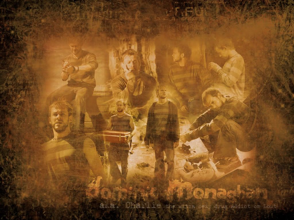
Can someone rate this blend/wallpaper that I made last night, please and thanks?

Charlie/Dom Wallpaper/Blend


I posted the link because the image is 1024x768.

_________________
Image

------------------

Thanks to the wonderful Neko for the amazing set.


Top
 
   
 Post subject:
PostPosted: Sat Oct 09, 2004 3:49 pm 
Honorary Member
Honorary Member
Offline

Posts: 4363
Joined: Tue Jul 13, 2004 2:40 am
Location: Down Under
bluehawaii: the blend is amazing, the only thing i've noticed is that you've chopped of the top of dom's head in the one where he's carrying the suitcase/box. other than that the blending is really really well done. I really like the way you've done the text, as it's not completely in your face, but also still readable. The texture you've used around the side fits just right too... 9/5/10

Could someone please rate this set i've made? suggestions are most welcome, as i can still change all of the image as i have the layered file saved.

Image Image
Program used: PSP8


Top
 
   
Display posts from previous:  Sort by  
Post new topic  This topic is locked, you cannot edit posts or make further replies.  [ 137 posts ]  Go to page Previous 15 6 7 8 9 10 Next

All times are UTC


You cannot post new topics in this forum
You cannot reply to topics in this forum
You cannot edit your posts in this forum
You cannot delete your posts in this forum

Search for:
Jump to:  
Powered by phpBB® Forum Software © phpBB Limited